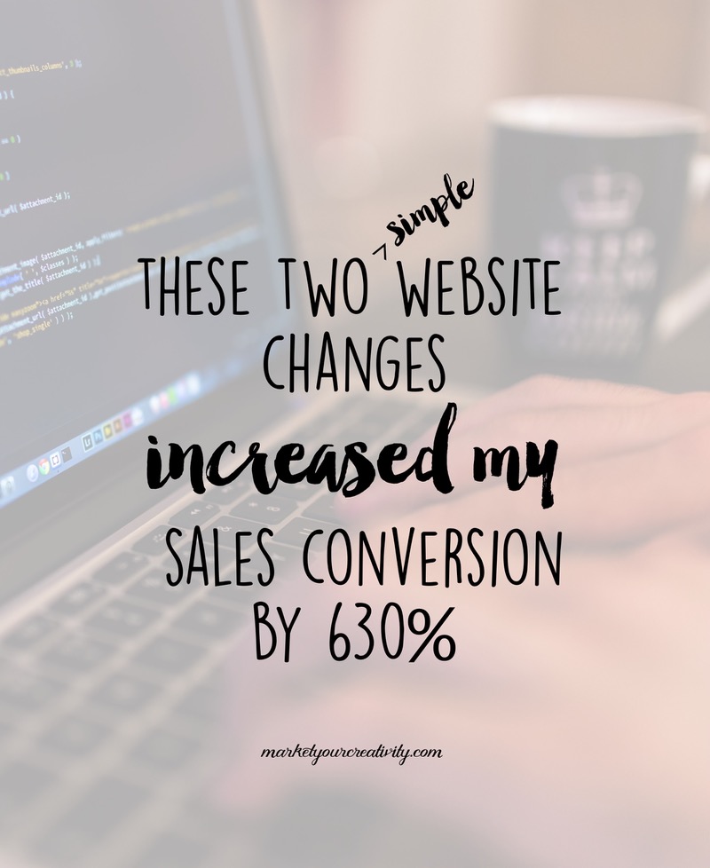
Oh boy, I’ve been so excited to share this post with you! Today I’m going to show you two simple changes I made that increased my blog’s sales conversion by 630% in one month’s time.
I welcomed a wave of new sign-ups to The Luminaries Club this month, and I want to show you exactly how I generated those results.
#1 – I offered a free trial
I built my own membership program because I’d joined countless memberships that really didn’t deliver what I needed as a creative entrepreneur. In fact, most memberships aren’t built for the right reasons; they’re set up so that members serve the creator(s) more than the creator(s) serves the members. With that in mind, the membership itself turns into:
- One more place to waste time online
- Little to no attention or direct interaction between creator > members
- Little value or updates inside
- Or worse, the membership turns into the “leader” show
The last one happened with one of the most useful memberships I’d joined to date; one of the co-founders just loved to perform and turned the entrepreneurial-based membership into an audience for his goofy stints and pointless ramblings. I couldn’t take it!
For people who like + respect the potential for a membership program (as I do), these are widespread and familiar issues. Obviously, some people were going to be afraid that mine was like every other membership program they’ve tried, all of which failed them.
Another big fear people were facing in signing up was that the material inside would be too advanced or not advanced enough, or worse, that it would be like every other book, e-course, program they’ve tried and never managed to implement.
All of these are very reasonable concerns, and moreover, there’s really no way for me to talk people past these hesitations on my sign-up page. It would get way too wordy.
In my case, a membership program is a way for me to work with a large group of clients at once. That’s what members of The Luminaries Club are to me: paying clients who deserve my time and attention. I built The Luminaries Club because I like results … your results. And I’m damn good at creating them!
Therefore, I design all of the materials inside the club so that they’ll serve your specific needs. I also make it incredibly easy to digest and implement the information into your routine. None of which you would know, unless you’ve been behind the scenes to check it out.
So, I offered a free trial of the club to my email list.
They not only loved it (hence the wave of new members), but they also told me the things that had been holding them back from buying (most of which were the concerns listed above). It reinforced some of the obstacles I knew I needed to address, so when I go to write promotional materials, I’ll come in armed with that knowledge and the language they used to express it.
For your product-based business, a free trial might mean a free + useful product with every order. I’ve given sample bracelets and cleansing smudge sticks for a limited time as promotions before. You might offer a very low introductory rate (because the repeat business that will come from this promotion is so worth it!). You might also start a monthly delivery service and offer the first month free (one of the Luminaries created a yarn club, and I just love this concept for both materials and products alike).
#2 – I added visuals + graphics to the sales page
My first sales pages was words, words, words, all the way down the page. I hated it, and I didn’t take the time to make it my own until recently. The new sign-up page is a DIY, rough draft of what I plan to have designed professionally down the road, but it’s still better than words, words, words.
While readers have always been skimmers (in other words, content does better with headlines and bullets that the reader can skim), people these days are bombarded with messages everywhere they look, and attention spans are shorter than ever before.
Therefore, skimmers have become scanners – meaning, they’re scanning the story or product page for something they can use to make quick visual sense of what they’re seeing.
Moreover, online business is a rapidly evolving industry. There’s always a new platform on the horizon, and right now, visual platforms (Pinterest + Instagram) are where it’s at. My traffic increased by 400% the minute I figured out how to utilize the power of Pinterest. It refers hundreds, sometimes thousands of visitors to my website every day.
If you’re not getting a lot of traffic referrals from Pinterest – it’s one of two things:
- Your images aren’t appealing, or
- The content doesn’t serve other pinners.
For my sales page, I made the payment plan a more visual offer, and I added in icons and screen clippings to help scanners make more sense of it all. My favorite place for these type of graphics are Creative Market <<< Search “icons” to see a full selection of icons for every niche + market.
So again, those two simple changes were: offer a free + enticing incentive for the customer to learn more about your business – and – add scannable, easy-to-understand images to your website and sales page.
Be sure to stay tuned for more prepping, planning and holiday-boosting articles! Until next time and all the best,

Pure Gold! I can’t wait to implement these ideas. Now it’s time to update my website. 🙂
Thanks for the tips! I arrived at your blog via Pinterest! Now, I’m a Club member…so excited to get started.
Thank you for such a timely tips regarding Pinterest and website changes.
What a great idea for the club, I would love to hear more about examples for product based business.
Thank you for these great tips 🙂